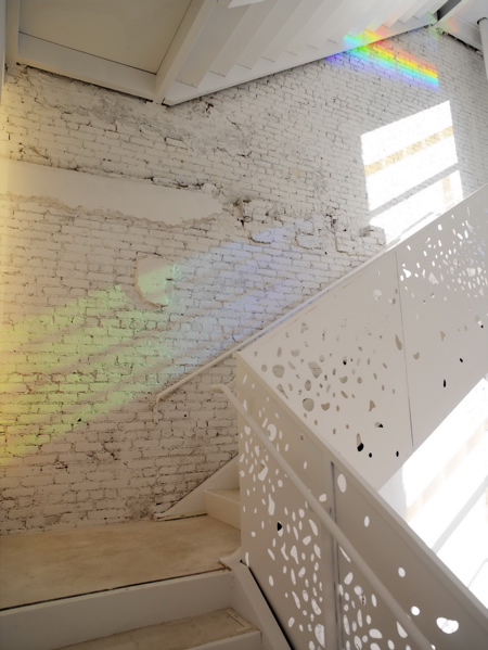
Saturday, 21 April 2012

MY PHILOSOPHY

Learning Centre
Design Philosophy and Brief consideration

  • Building to have a strong connection with its surrounding environment
  • To feel nurtured and inspired within the internal spaces
  • To interact with the outdoor spaces in some way
  • Function to create form
  • Living room in the city
  • Practical hands on areas instead of purely visual displays
  • A place that provides after school supervised activities for teenagers and quite possibly a environment where they can seek assistance with school homework of all types.
  • A place where the basic life skills are taught (how to grow vegetable gardens, how to cook healthy meals, how to interact with others, how to budget etc).
I believe that there should be a stronger emphasis on function to create form rather than trying to fit functions withing a restricted structural arrangement.  A building should look balanced and complete without going too overboard with materials and odd shapes.

Environmental sustainability is a very important aspect of any building and this shoudl be considered right through from site preparation and material selection to building maintenence and ongoing useablity/adapdability.

In my research (through surveys) I have discovered that consistently there was a desire to interact or at least be able to see an outdoor area from the indoor spaces.  People wanted glass walls, open spaces, garden areas, natural light penetration.  There was also a need to incorporate some seating in between the book shelving, just for those moments when you need to sit down and quickly flick through a book to check that it has the information you require.

I believe the role of a Public Library is to provide:
  • A building which helps to cement together a community
  • A building that is a meeting place
  • IT learning and support centre
  • An access point to council and other services
  • A life long learning centre
  • A building which usually compliments an art gallery, museum or other
  • A place for community group projects

Space allocation
(Consideration to be given to the following)

Collection:
  • Reference collection
  • Fiction colection
  • Non fiction collections (Local studies, community languages and indigenous collections)
  • Large print collection
  • Children's collection
  • Audio visual collection
  • Special genre collection eg. Business, gardening etc.
Activity Areas:
  • Children's activity area
  • Computer games area
  • Young adults area
  • Family history service area
  • Informal reading and browsing area
  • Newspaper and periodical area
  • Study areas including separate group rooms
  • Theatre/lecture room/auditorium
  • Outdoor area/courtyard
  • Public art
Technology areas:
  • OPAC's
  • Public asscess computers, scanners, photocopiers
  • Audiovisual areas including listening posts, computer games, telvisions for dvds, portable devices
Service Areas:
  • Reference/Information desk
  • Children's desk
  • Circulation desk/self checking area
  • Community information/display
  • Community services
  • Entry foyer
  • Exhibition and diplay area
  • Refreshment area/coffee shop/vending machines
  • Banking services 
Ancillary Areas:
  • Kitchen facility
  • Public toilets including baby change and or parents room
  • Staff work room
  • Librarians offices
  • Specialis work areas (eg home library service/mobile library)
  • Stack areas and other storage facilities
  • Storage for archival materials
  • Staff room, staff toilets, shower
  • Public lockers/storage
  • cleaners storage
  • Loading and delivery area
  • Change machines and public phones

People involved with a library:

Staff
  • Librarians
  • Security
  • Cleaners
  • Admin and receptionists
  • IT
  • Gardeners
  • Audits
General Public
  • Student borrowers
  • Families - mum, dad, children
  • Elderly
  • Professional groups
Reps

Deliveries


Sunday, 15 April 2012

EXEMPLARS WEEK 6


This tute session we went through everyone's blog and each person gave a talk on some buildings which were inspirational to them.

some of my favourite exemplars were:

NYU Department of Philosophy (Steven Holl)

http://www.stevenholl.com/project-detail.php?type=educational&id=21&page=0


2007913nyu_-0170.jpg2007913nyu_-0123.jpg

The facility includes faculty and graduate student offices, seminar rooms, a periodicals library & lounge and a ground floor 120-seat cork auditorium. Steven Holl Architects organized the 30,000 square feet of interiors around a concept of the phenomenal properties of light and materials.
This vertical connection in light is activated by the presence of faculty members and students and by a prismatic film splitting the available sunlight periodically. The light effect in the stairwell changes according to the seasons and the time of day.


This building caught my attention mainly due to the use of light which was obviously planned and considered during the design of the building.  Its deliberate and intended affect on the spaces in conjunction with the materials, textures and colour pallette works so well to create such interesting spaces.


Orestad High School Copenhagen

http://www.archinnovations.com/featured-projects/academic/orestad-college/

col_03.jpgcol_02.jpg


col_04.jpg

The college is interconnected vertically and horizontally. Four boomerang shaped floor plans are rotated to create the powerful super structure which forms the overall frame of the building – simple and highly flexible. Four study zones occupy one floor plan each. Avoiding level changes makes the organizational flexibility as high as possible, and enables the different teaching and learning spaces to overlap and interact with no distinct borders. The rotation opens a part of each floor to the vertical tall central atrium and forms a zone that provides community and expresses the college’s ambition for interdisciplinary education. The storey decks are open towards a central core, where a broad main staircase winds its way upwards to the roof terrace. The main staircase is the heart of college educational and social life; the primary connection up an down, but also a place to stay, watch and be seen. Three ‘mega columns’ form the primary load bearing system, supplemented by a number of smaller columns positioned according to structural requirement, not as part of a regular grid
The rotated decks are mirrored in the facades. Due to their rotation, the decks create openings double- and triple high while drawing lines on the façade. As a rule, the glass is smooth with the deck fronts, but on each floor, one façade is withdrawn to create an outdoor space. These outdoor spaces are connected from ground to roof. In front of the glass facades, a series of coloured semi-transparent glass louvers can open or close to protect from the sun, while adding dashes of colour to the indoor environment.

This building was of interest to me, due to the way in which relaxed study/reading/group areas were of high importance in the layout of the building.

I love the way that large areas have been dedicated to ensuring the comfort of the users.  Paticular attention has been paid to the age groups that would use these spaces.


Now may be a good time to elaborate on the exemplars that I posted last time on my blog.


Seattle Public Library (Rem Koolhaas)

http://oma.eu/search-results?searchword=seattle+library


FORM FOLLOWS FUNCTION
Rem Koolhaas is a Dutch architect whose main approach is to let the buildings required functions dictate what the builing should look like, rather than imposing a structure and making the functions conform to it.

An early design method discussed in his book Delirious, was 'Cross-programming' whereby unexpected functions were introduced into room programmes.  An example of this was running tracks in skyscrapers.

At one stage Koolhaas proposed the inclusion of hospital units for the homeless into the Seattle Public Libary.

Seattle Public Library is one that I know a little about and has been one library that has stuck in my memory, not just for some particularly interesting design features, but also because of the story behind the design of the library.  During the time that the idea of creating a library in Seattle was occuring, so too was a shift in thinking about the way a library should be designed and built.

For many years the library has been considered a place that houses just books alone, and those that used the library for research etc were to remain as quiet as mice.

http://www.spl.org/about-the-library
Some features of the library include: 
  • Creation of reading rooms which inute contemplation, reflection and information exchange across media types
  • Abandonment of the sterile, silent world of the typical library
  • An iconic structure.

Friday, 23 March 2012

HOWARD SMITH WHARVES ENTRY 6

So after 3 very late nights and almost an all nighter... I have something which may be suitable for the presentation.

In the very early hours of Tuesday morning after a receiving a certain email, I am fed up with a certain person's whole approach to the assignment.  I send an email which firmly reminds him that it is a team assignment and it is too late to be having arguments about which model is better and changing the entire form of the folie.  If he had of been involved earlier on and attended the meetings, he may have felt a bit more involved in the decision making of the group.

Anyway all that aside, Tope and I managed to meet up again on Wedneday and thoroughly went through the posters and checked the content and layout as best we could.

Some of the final images include:

3d view of facade facing Story Bridge (giving a good impression of the fixed glazing and shutters which open and close depending on which part of the Story Bridge is to be viewed).

Section showing how the structure cantilevers off the cliff.  Also giving an indication of the floor structure and the two platforms used to create an experience within the folie.


Tuesday, 20 March 2012

HOWARD SMITH WHARVES ENTRY 5

So it is the Monday before our folie is due and unfortunately we have a certain team member who seems to not agree with what the majority (who attended team meetings) has agreed upon.  Josh would like to change the final outcome and unfortunately Tope and I think it is way too late in the peice to be changing the whole concept.  At this stage there has been no input by the fourth member.

So with the due date coming quickly, Tope and I continue to steam ahead so that we have a unified well thought out assignment for presentation on Wednesday.

I am continuing to develop the structure, interior and exterior views, the section and also working out materials.

Tope has been in charge of pulling together the overall layout of posters, sketches and additional images for posters. 

We arrange to meet again on Wednesday.

Monday, 19 March 2012

HOWARD SMITH WHARVES ENTRY 4

Well the Saturday meeting did not eventuate.  I had tried to email all group members, however as the morning went on, no one was contactable. 
I decided that something had to be started so I spent quite a few hours on Saturday putting down into text what I believed was the summary of what we had all discussed at last tutorial.  I managed to finish the 300 word text component of the assignment and forwarded it onto the other team members for comment along with some extra information I had found on the Story bridge. 
Mainly I was quite interested in the materials - where and by who they were fabricated by.

There were quite a few images that I found also, regarding an insight into the workers experience:

Source:

Source:


Source:
http://bishop.slq.qld.gov.au/view/action/singleViewer.do?dvs=1331947411958~60&locale=en_GB&metadata_object_ratio=7&show_metadata=true&VIEWER_URL=/view/action/singleViewer.do?&DELIVERY_RULE_ID=10&frameId=1&usePid1=true&usePid2=true


In response to the info I sent, Tope replied with the idea that maybe our floor could be construted out of glass with and that experience that the user of the folie would have would be related to learning about the experience of the workers.  In the sense that the workers had to walk across steel beams, high up in the air without safety equipment.  Possibly the experience or learning would be to do with learning about that experience of the workers who built the bridge with their own hands.

After not hearing from other members I contacted Tope and mentioned that it was probably too late in the day and that we should re-schedule to Sunday.  I originally had changed my weekend to fit in with the Saturday meeting but then found myself working the whole weekend on the project.

Tope and I managed to meet on Sunday at uni and we discussed a draft form that Josh had emailed through, and decided that we needed something a bit more substantial than his 5 min sketchup model to be able to communicate our ideas.  We decided that the text I had compiled was to used on final panels and I would model something up in Revit.  We agreed that the views of the bridge and the experience within (glass floor, visible steel floor structure and some kind of platforms for the user to physically walk on) were going to be the basis of our concept. 
Josh had also responded with a suggestion for the background of the poster, however both Tope and I agreed that it was way too dark, in fact his whole concept was becoming a little dark and didn't really link in with the ideas that we had discussed.   
My Sunday and sunday night were spent modelling up final form and trying to work out the structure of the floor.
We would need bearers and joists.
So what we woud end up with is a few very large steel I beams and on top of that would be PFCs (Paralell flange channels) spaced around 450mm.  In addition there would be a perimeter PFC to finish it all off.

Possible ideas:

Possible layout of floor


Trying to work out overall form and how the floor structure would work.  Also thinking of possible cladding materials.

Working out how a glass floor works.

Materials, Fixed window Glazing and Final Panel layout.


final detail for roof?  unfortuntely didn't get timeto implement this though.


Thursday, 15 March 2012

HOWARD SMITH WHARVES ENTRY 3

Ok so we now have 4 members, apparently Josh and Ronald will be joining our team.
Tope and I had tried to get in touch to arrange a meeting prior to the lecture, however there was little response.

We attended the week 3 lecture and were bocoming a little anxious when we arrived at the tute and there was no sign of the new members.  I contacted Ronald by phone and he mentioned that they (Josh and Ronald) were just finding a park.  When they eventually arrived, we summarised what stage Tope and I were at with the project and we thought we better have a discussion about where everyones strengths were and how we were going to try and divide the tasks.  On questioning the boys about their attendance to lectures - they both mentioned that they had not attended any to date and that Josh had attempeted this subject last year.

As the end of the tutorial approached, we thought we better run our ideas past the new tutor and see if were on the right track.  Unfortunately he didn't agree with our ideas and felt we needed to focus on something like the floods that occurred and develop a stronger learning to occur within.

All four of us brainstormed and tried to work out a learning that could occur that fitted in with all the work we had done so far.  Our second idea was disliked by the tutor and we were feeling a little deflated by that time.

We then let the tutor know that we were struggling a little and really need some extra help.

In keeping with the idea I had of framing certain views,  Tope tried to look at the idea of the development of certain buildings over time, which could be seen from the folie location.  This idea was not ruled out entirely however instead of focusing on buildings, we decided to focus on the Story Bridge.

So in keeping with the idea of views toward the Story Bridge, we ended up with the idea of capturing parts of the Story bridge through 3 glazed openings (showing a kind timeline as such of the construction phases).

Tope and I had previously discussed having a glazed structure with vine type elements encasing part of the structure - allowing smaller framed views in addtion to the larger opening.
Below is his initial concept drawing.

Tope's original concept drawing

Prior to week three tute, Tope and I had met up to try and nut out what the learning would be within.

Some key ideas were:

What is the kind of learning?
Structures designed as part of an environment not individual items.

What is the trigger for the learning?
Movement vertically in alignment with and being able to view up close a natural object (cliff face).

How did design process start?
Scale.  We considered the enormity of the cliff and decided that the folie should work with that vertical axis.
Design is generated from nature and relflects te texture of the cliff.  It captures snippets of surrounding area by way of framing and restricting views as well as reflecting some views.

At the end of the tutorial we tried to arrang a meeting to finalise ideas etc.  Ronald claimed to be working most days and seems disinterested in the urgency of getting our project done by the following week.  Josh has some great ideas but it was hard to get him to commit to meetings.  We all agreed on Saturday as the next meeting day.